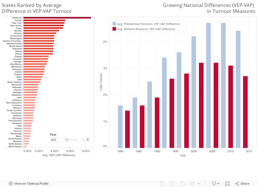
Fig. 2.2. VEP–VAP Differences Grow Until Mid–2000s
In Fig 2.1 noticed that the differences between VEP and VAP were not constant over the years, so we decided to see what these differences looked like over time.
In Fig 2.2. we plotted the result (difference) of VEP–VAP turnout rates for all states and years. The result shows that the differences between VEP and VAP grew rapidly between 1980 and around 2006. After 2006, the differences begin to decline. While not graphed here, the VEP rates showed a little less variation (SD).
Standard Deviation for all states' turnout rate calculations by election year type:
| Presidential Years |
Midterm Years |
|
| VEP SD | 0.072378 | 0.079388 |
| VAP SD | 0.073805 | 0.080766 |
The ranked bar chart on the left shows each states average difference in VEP-VAP. Notice that the VAP rate bias is substantial in several states and that its varies from state to state.
This observation lead us to our last set of visualizations.