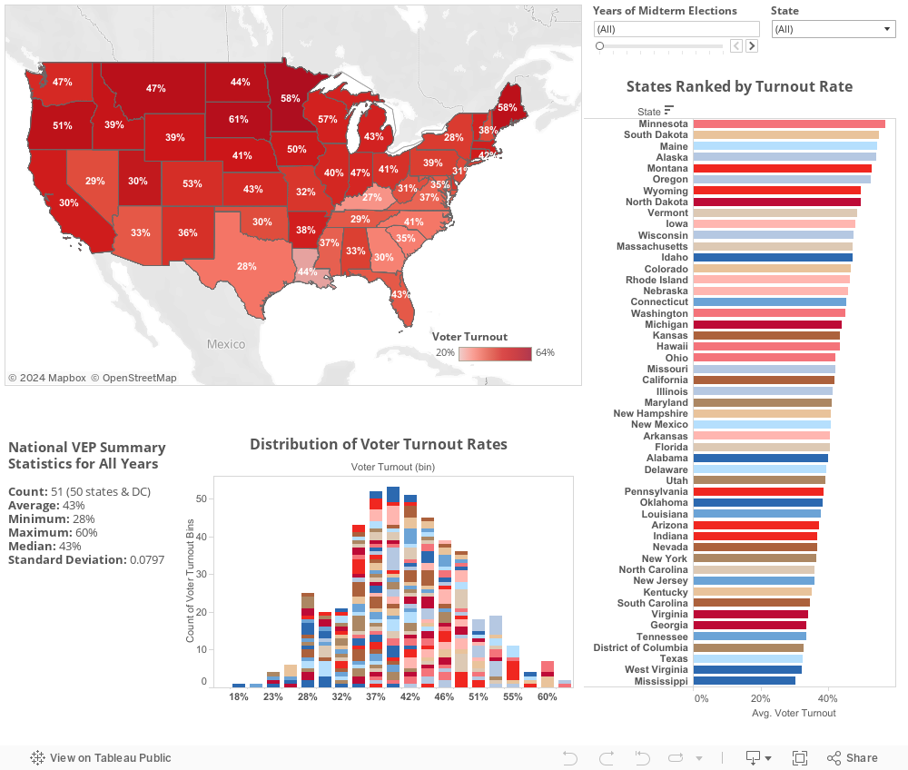
Fig. 1.2 Voter Turnout (VEP) for Midterm Elections 1980-2014
Fig 1.1 and Fig 1.2 display the results of voter turnout rates calculated with McDonald's VEP method. The visualization defaults to displaying the average of all years in the dataset. At the top right there are 2 filter methods. The slider allows users to scroll through the years individually. The dropdown menu allow users to display only certain states at a time. To give the viewer a better picture of the state-level data within each year, we have plotted a distribution chart beneath the map and a list of the states ranked by turnout rate to the right.
- From these visualizations, we noticed two interesting patterns.
- When viewing all years in the dataset, the distribution of turnout rates create a lovely bell curve. However when viewing individual states, the turnout rate distribution is much less normal than we expected.
- When viewing the map and ranked list by year, the same states tended to occupy the 'top ten' spots for highest turnout rates in both presidential and midterm elections – Minnesota, Alaska, Montana, North Dakota, South Dakota, Maine, Vermont, and Oregon. These states are predominantly northern, low in racial diversity, and have large rural populations/smaller total populations. These findings led us to the test described in Fig 1.3.