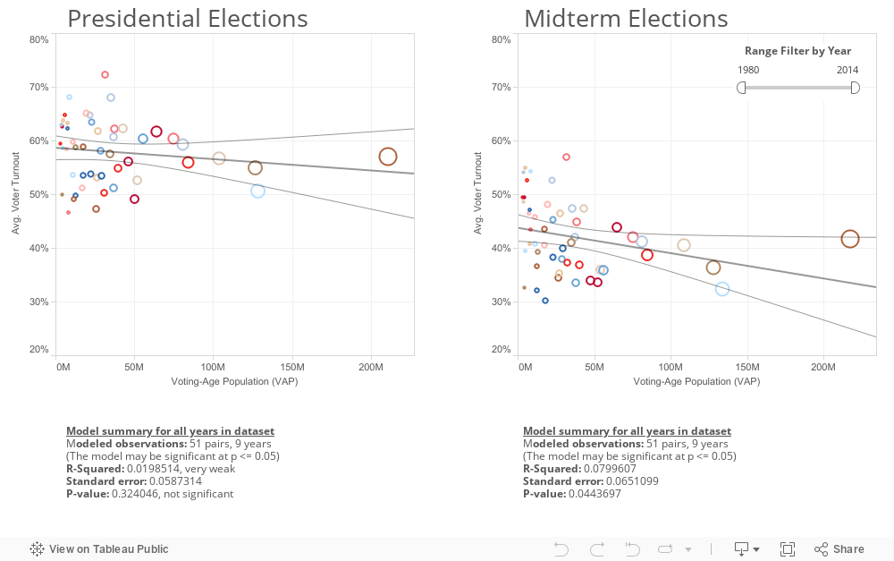
Fig. 1.3. Potential Relationship Between Population Density & Voter Turnout Rates
In Figure 1.3, we sought to visualize the relationship between a state's population size (in this case VAP) and their turnout rate (VEP method). We created a simple linear regression model, which can be filtered by year. The model graphs the the average turnout rate and total VAP by state. The size of states' VAP is mapped to the scatterplot symbols, and the tooltip reveals the state, VAP, and turnout rate visualized by each symbol. The trend lines and confidence bands are graphed in gray. The models show a weak negative relationship between a state's population density and voter turnout rate.